Mistakes to Avoid on Your Web Site
Many of the world's websites suffer from mistakes that can dramatically impact their effectiveness. We've compiled a list of the 17 common mistakes with helpful advice on how to avoid them.
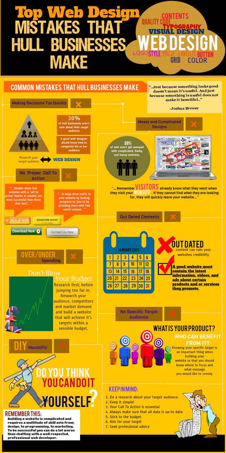
Many of the world's websites suffer from mistakes that can be easily avoided. It is our hope that this list will help you to ensure that your site is not similarly afflicted. Some of these problems merely result in irritation, whilst others will inhibit or prevent visitors to your site from accessing the material or functionality that you have placed there.
No matter how well or how poorly your site is implemented, by far the largest mistake occurs when the website's role in the overall strategy of your organisation has not been well thought through. Only once the strategic purposes and role of the site are understood can the site be built in a manner that achieves those objectives. For a pilot, this is akin to bringing your plane in for a nice, smooth landing only to find out that you've landed at the wrong airport.
1. Lack of Accessibility
Accessibility refers to the ease with which a wide spectrum of users can access your site. On one level it can relate to the specialist web browsers that are used by people with a disability – a significant market in their own right. It also refers to the vast array of equipment, operating systems and browsers that are used to surf the web. Some examples to consider include: Visually impaired people surf too: Does the font size on your site increase if a visitor changes the text size from "medium" to "largest" in their browser? Does the page layout of your site fall apart when a visitor changes the text size? Small devices: What does your site look like when accessed from a PDA or mobile phone? How long does your page take to load at GPRS speeds? Other Operating Systems: Microsoft's Internet Explorer doesn't run on the Mac or Linux. How does your website design look on Opera, Safari or FireFox? Old Browsers: Believe it or not, there are still plenty of users running browsers that are 4 or 5 years old. A good website designer will take advantage of the formatting and presentation capabilities of the newer browsers, whilst "gracefully degrading" when viewed with an older version. Screen Sizes: There has been an explosion in the variety of screen sizes. Your site needs to be able to display appropriately on different sized screens, and it can't be assumed that the user will have their entire screen allocated to their browser.
2. Infrequently Asked Questions
Have you looked through an FAQ page and been irritated by the irrelevance of the questions? Have you wondered if the questions had ever been asked, let alone frequently? If so then you're not alone. Many sites no longer have FAQ pages and have instead updated their content to provide that information. However the point here is not so much about how fashionable the FAQ is or isn't - the point is that all of the content on your site needs to be relevant to the people who are likely to visit the site. Relevant content will give them a good impression and will increase the likelihood that they will take the next step towards becoming a customer.
3. Can't find contact information
We're constantly amazed by sites that make it difficult to find physical contact information. For small and medium businesses this is critical as your contact information provides a key link to reality, giving customers confidence that they are dealing with a real business rather than a scammer. Contact information should include conventional contact methods such as phone and your business address.
4. Click Here To Enter Site
Don't waste your home page with a "Click here to enter site" link or a gratuitous splash screen. Your website visitor is already here, so reward them immediately with useful, relevant content.
5. Audio
Audio should be used sparingly on any website and it should never be played automatically, especially if you are trying to reach users in a corporate setting. The best sites that use audio require the user to click a "play" icon. For sites that need a voiceover, you will dramatically enhance your organisation's image by having the track professionally recorded.
6. Too Much Flash
Flash is great when used sparingly and tastefully. Flash can add excitement and movement to your site, adding capabilities that are difficult or impossible using only HTML. Unfortunately it has two key detractors: not everyone has flash and not everyone has the bandwidth to support flash. If you have decided that it is appropriate to use a sizeable flash component on your site then make sure that the user receives visual feedback while it loads.
7. Too many meaningless graphics
The graphics on your site should enhance the user experience. This needs to be kept in balance – enough to ensure that the site is attractive and functional, but not enough to create clutter and slow down the user experience. Site graphics need to be optimised to ensure that the site is displayed at a respectable speed.
8. Search Engine Unfriendly
Whilst having a search engine friendly site won't guarantee you high rankings on your favourite search engine (that's a discipline called Search Engine Optimisation), there's no excuse for not having done the basics. These include having a site map, concise and relevant content, use of standard mark-up tags that are recognised by search engines as well as meta tags such as keywords and a description.
9. Welcome to Our Website
Commence your content with something a little more compelling that "Welcome to our website". Such an opening appears amateurish and communicates to a visitor that the site is in no hurry to provide them with useful information.
10. Poor Navigation
Navigating through your site should be intuitive. This means that the site navigation should be organised and presented in a manner consistent with accepted web navigation conventions. Stick to standard techniques and standard locations for navigation elements such as links and menus. Links should look like links. It should be easy for a visitor to find the "home" and "contact us" links. As well as having navigation elements that are easily recognised, it is important to think through the logical organisation of your site. One useful metric to keep in mind is the average number of clicks required to find a piece of information or to access a page. Another key aspect is how easy/obvious is it for a visitor to find out which link to click on. For example, to find "double sided tape" on your website, should they look under "Art & Craft" or "Office Supplies"?
11. Poor Colour Schemes
A poor colour scheme will distract visitors from your message. At worst, the message will become unreadable. It is also important to keep vision impaired users in mind, so if your site features coloured text on a coloured background then it would be wise to offer a high contrast option. This can easily be done using style sheets.
12. Expecting that people will read your Web Pages
Very few people read a web page in its entirety. Rather, people scan web pages looking for relevant information, zooming in on the elements that catch their interest. It is therefore important that information be well ordered and easy to locate on the page.
13. Pop-up Windows
Unless you have a very good reason, avoid pop-up windows. They are irritating and many browsers block them.
14. Dead Links
All of the links on your site should work. Having users visit your site and encounter broken links will look unprofessional, cause frustration and undermine the confidence of visitors in your site and hence your organisation. All links on your site should be properly tested. Links to external sites that are not under your control should be tested on a regular basis, especially if they link deep into the content of that site.
15. Requiring That Surfers Install Software
Generally, users will not want to install software to view content on your site. By default, most browsers block websites from installing software. Exceptions to this rule are some extensions/applications that have gained widespread acceptance such as Acrobat and Flash.
16. Pages that are slow to load
Web surfers are notoriously impatient and will punish slow sites by leaving them. A good site will load in no more than a few seconds. Reasons for slow loading pages often include such factors as overloading a site with pointless graphics, sub-optimal graphic formats and hosting factors such as using an overseas hosting company or a "backyard" hosting company. If there is a legitimate, unavoidable reason for having a slow site, then provide visual feedback for the visitor while it loads.
17. Not monitoring your site
There are numerous tools available for monitoring your site. They can provide valuable insights into the behaviour of users on your site, allowing you to determine where they come from, how they found your site and the kind of content that they are interested in and which links are the most popular. With excellent tools available free of charge, there is no excuse not to monitor who is visiting your site and what they do once they arrive.